The making of a mascot – Part 1

So, you have probably realized at this point that our last name is Drake.  What a cool last name, huh?

Naturally if we’re going to have a mascot, it’s going to be a dragon. I suppose that some Drakes might go for a duck, but not these Drakes.

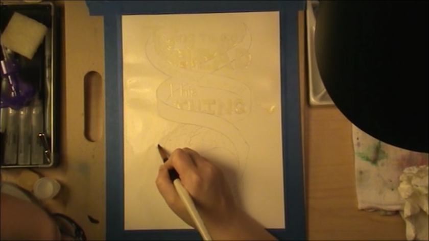
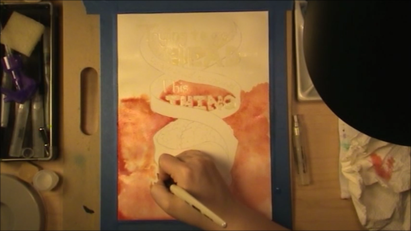
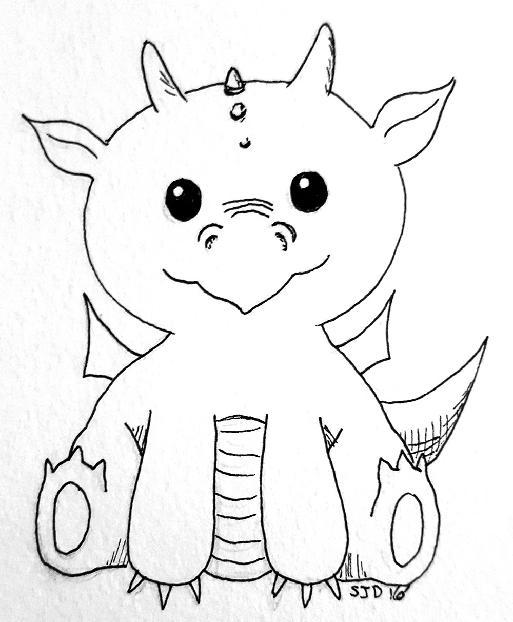
I started with the little dragon that goes with the D in the logo that I made.  And then eventually I wanted to get back to working on developing him more. I hadn’t come back to it, and then I heard of the #100dayproject. It’s a fun artist thing where you pick a theme and do that thing for 100 days. I decided that I would do #100daysofdragons. They haven’t all been along the lines of this mascot, but I’ve done quite a few that I am happy with.  I thought I would share them here, with the occasional comment thrown in.

These were my first 3.  The big guy there became my starting point for our mascot.

dragon4-100

This guys was done in watercolor pencil without an under-sketch.

He’s kind of funky but it was something new to try.


I did an entire post about my Rock Dragon-saurus.  The initial drawing and the painting I let count for 2 days.

Fun stuff :).dragon9-100

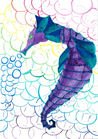
This guy was supposed to look more sea-dragon like, but I forgot a couple of details I had penciled in.  My mom loved it enough to swipe it.

dragon10-100


I feel like I called it in most on these.  They were super quick unfinished sketches.

dragon11-100

This is one I did from the contents of my Sketchbox for the month.  I started with a purple shape and went from there, so I am quite happy with him.

A couple more freehand images.

dragon14-100

I drew a really rough sketch for him, and then filled it in with some new Sharpies that I got.  I’d never made art with Sharpies before.

dragon16-100

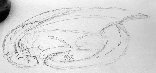
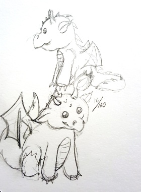
Some more sketches. I should ink the sleeping dragon.

dragon19-100

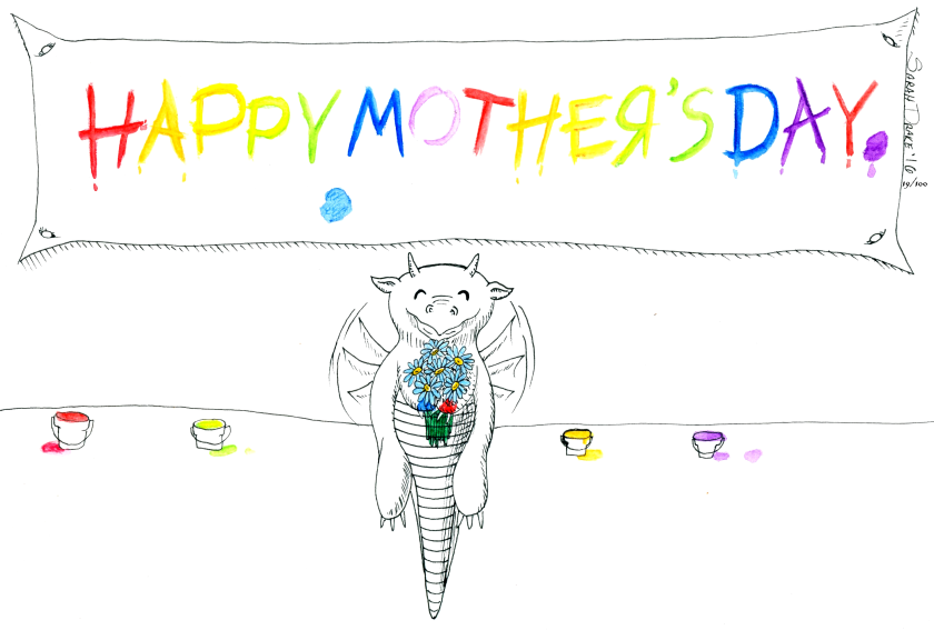
A fun Mother’s Day poster 🙂

I decided to do some illuminated letters.  The blue didn’t stand out against the black all that well.

dragon22-100

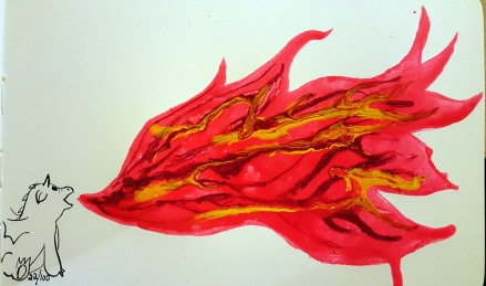
I did a bunch of stuff with my Bombay Inks on this day, so I did a big flame and a little dragon.  The colors didn’t bleed the way I thought they would.dragon23-100

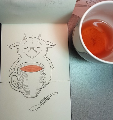
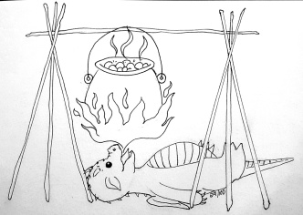
I was inspired by my tea for this one. I love his little face.dragon24-100

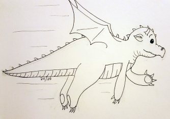
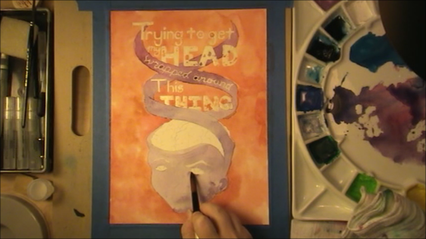
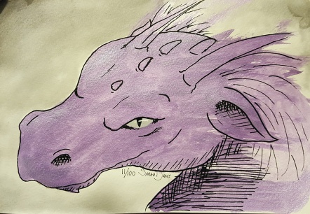
Trying to explore another angle.  I don’t quite have the full anatomy of this guy figured out yet.


dragon25-100

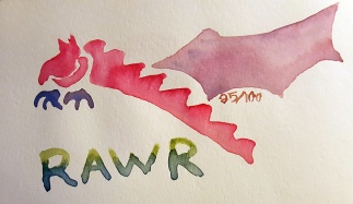
I did this guy after I spend some time painting some watercolor roses. Rawr.


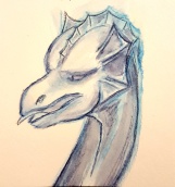
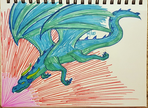
I LOVE this guy.  I couldn’t help but add the color to him, but I loved him just as much only in ink. He’s like the mascot dragon, but older. I eventually want drawing this guy however I want to be second nature.  That’s going to take a lot of dragon drawing :).

I really love this style.  The watercolor sat weird on my Moleskine watercolor book though.  I’ve never seen paper absorb watercolor in quite that way.dragon28-100

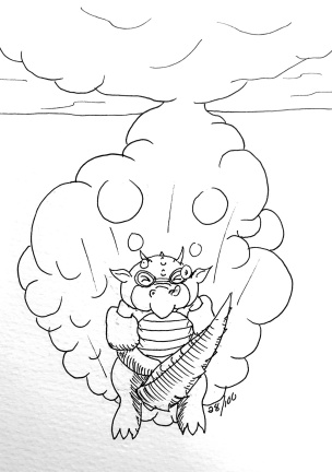
The kids were at swim lessons when I dreamed this guy up.  It’s rather difficult to draw a dragon doing a cannonball.

dragon29-100


Funky shaped head there…

These are a couple of freehand watercolor experiments. The orange one was on that funky Moleskine paper again.  Not every page in the book does that thing, but it’s irritating.  Probably I won’t buy another one of their watercolor books. The green dragon was done with a shiny

Isabelle gave me the idea for the dragon in the tree. The other was me trying to draw a Chinese style dragon that could live in the other dragon’s world.

I’ve learned that I don’t really like the anatomy of dragons.  Not if I am trying to draw anything “realistic”.  I like my little cross between a balloon animal and a stuffy. It has been interesting to study different types of dragons. I’m going to have another go at my seahorse dragon, because I think it could be cooler.

So that’s a third the way through my 100 days project of drawing dragons. I will compile another post when I’ve done the next 33. You can watch me on Instagram to watch in real time throughout the project.

Playing with watercolor crayons

It’s been a hectic week at Team Drake headquarters.  Work is crazy, plus parent/teacher conferences and 2 days of no school for my kindergartener.  I will take this opportunity to brag on her for reading at a 2nd grade level :). My kids are amazing.

I got to take some time today to play with my watercolor crayons and practice some different techniques with them. I have a 12 set of Staedtler Karat Aquarell Premium Watercolor Crayons

watercolorcrayons1
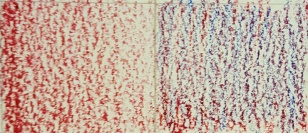
They pretty much lay down like regular crayons, especially on textured paper.

On the left I laid down some red, and on the right is red and cobalt blue. On their own, the colors layer, but don’t blend.

watercolorcrayons2
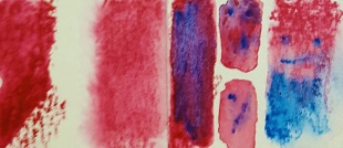
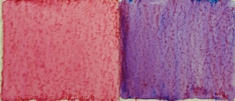
If you lay down the color lightly, it’s easier to mix the pigment with the water, meaning you don’t see the crayon marks.  Having spots where the crayon marks show up more in some places than others is a fun way to get texture into a drawing. If you don’t want the texture and you want bright color, you probably want to do something other than put the crayon straight to the paper.

watercolorcrayons3
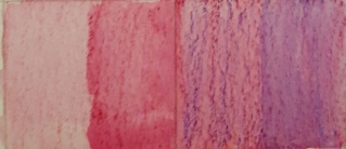
Here I put down some red on half of the block on the left side, and then went over it with water.  Only a couple of layers makes a much bolder color.  On the other side I put a layer of cobalt blue on top of a dried glaze of the red.  I went over half with water.  Even layered the colors blend really well.

watercolorcrayons4

On the left of my 2 boxes here, I got my brush wet and pulled the color from the crayons to lay it down on the paper.  You would not want to do a large area this way, but it’s a good trick for small details.  On the right side of each box, I did a water wash before putting the color down.  I’ve used the lid of my crayon tin as a palette before to mix colors, or to get a bit more paint for a wash before.  It works pretty nicely.

watercolorcrayons5

I’ve also dipped the crayons directly in the water.  This gives you a really bold color, but the wet doesn’t sink down very far, so if you’re doing this be prepared to dip your crayon a lot.  Another fun effect is to do a water wash on the paper, and then draw on the wet paper. If you’re layering color, use the lighter color as the 2nd color, and you can use it to mix your pigments a bit.  It makes for a nice splotchy effect.

watercolorcrayons8

Here I put down a dark line of color and pulled it out with my wet brush.  You can get quite a lot of color to move, but as I said before, it will leave a mark behind.  If you scrub the paper too hard with your paintbrush to try to get it to blend, you’lwatercolorcrayontree
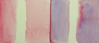
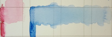
l start to muck up your paper.  Not that I would know anything about that.  Ever.

And just for fun, I pulled out my greens, blues, and sienna and made a cute little tree.  The eyes were Husband’s idea.  I think they are a nice touch.

If you like watercolor, you should also check these out.  There are ways to use them just like other watercolors, and ways to use them that are unique to the medium.  Have fun!


The Honeybee Stakes

Horseracing is an interesting industry.  Without going too much into that specifically, I can say that some of the horses have very interesting names. Some of them I am convinces are a joke against the race callers.  “Arrrrrrrrgh” is a horses name. Often a horse is remembered by having a race named after them. I’ve gathered a number of these races – one for each month – and I am going to do an illustration for them.  This is my illustration for the Honeybee Stakes.  I’m going to walk through the process, and there’s also a speedpaint video as well.HoneyBee_Clipped.00_00_39_08.Still002

Once I had my rough draft done, I traced the sketch onto better paper using my light box.  After that, I used masking fluid to cover up the little bees and the letters.  Then onto a water wash for what will be the grassy area.  I get a much smoother wash when I use wet on wet.

A little dry time, and then I do the water wash for the track area. I enjoy the way you can just build on top of water color to make the painting as rich as you want.  I did a few layers of darkening the brown of the track before moving onto the sky.  Having the bees and the letters masked made it quite easy to do a nice sky wash.

HoneyBee_Clipped.00_02_29_07.Still004
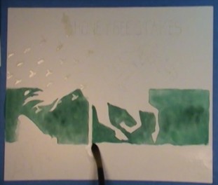
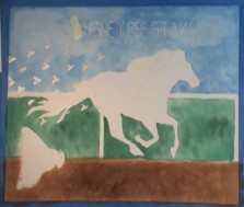
Dabbing at the wet blue paint with a paper towel makes for nice little impressions of clouds.

I didn’t mask the big bee, so I was careful around him, as well as my runner and the rail. Once the blue and green were dry I rubbed the masking fluid off of there.


HoneyBee_Clipped.00_09_22_06.Still006

Next onto the horse, and starting on the jockey and the bees. I used a photo reference of the horse to make sure the shadows were in the right places.


HoneyBee_Clipped.00_12_40_20.Still009


Lots of Tiny bees. No wonder the horse looks worried.

I finished the details at the end with colored pencils and a white gel pen.

The original lapsed time for the video after chopping out all of the pauses was 4 hours and 11 minutes.  I also chopped out the time to mask the bees and letters.


Learning to draw (again)

I’ve spent the last year and a half learning how to draw again after a hiatus.  Everyone draws when they are a kid.  I don’t remember being really obsessed with drawing when I was a kid, but often wishing I could draw well (evidently not understanding it was something I’d have to work for).  I do remember some things that I would draw in junior high.  There was a flying serpent I drew a billion times in 7th grade, and then a cute puppy I drew a billion times in 8th grade.

I discovered Anime in the 9th grade, and that’s when I started being known for drawing.  I’ll go ahead and admit my first anime drawing was copying a picture of Sailor Moon off of my DIC VHS.  I actually got good at copying rather quickly.  I guess drawing what you see when someone has already done the line work for you is easy, relative to drawing from life.  In high school and a while thereafter, all I drew was anime, and most of that was girls (I probably drew a dozen guys or so in all that time).  Someone would tell me I should draw something else, and I would actually say “sorry, that’s not what I draw”.  Seems so silly now. I thought I was pretty good.  Character designs and pinup type stuff.

bllll_da_by_marimaru-d91k6p0
Dynamic hands was not my thing.

I still like a lot of that stuff from back then.  I should redraw some of those that I like and see how they come out.  Some part of me was determined that I’d get found and be given an art job, I suppose?  Life happened a bit, and when my oldest daughter was born, I pretty much quit drawing.  Two summers ago (5 years after said daughter was born) I picked up a sketchbook that wasn’t full and started just drawing the things around me.  The car, a tree, my daughters, etc.  I was pretty excited when that sketchbook got full, and the one after that.  Filling a sketchbook is a really accomplished feeling, and I love it.  I had an old set of watercolor paints that was given to me, and I broke that out and started adding watercolor to my sketches.  I also started 2 acrylic paintings that I have not finished (I will finish them some day, I am sure).  I’ve been through trying out a huge variety of supplies this last year.  Husband got me a subscription to ArtSnacks for my birthday last year, which has been AWESOME.  I’ve asked for something else this year, but if I ever get in a slump, I’ll definitely consider doing that again.  Besides, who doesn’t like a surprise in the mail once a month?

20160220_131247
A decent representation of the various supplies I might grab for any one project

In this recent time, I feel like I have really learned how to draw.  Between being willing to try to draw just about anything, and learning better how to draw what I see.  Husband often says to me “someone should make …” followed usually by a funny idea.  One day I realized that I could make those funny things he was talking about… at least make a picture of one.


Buttercup
This is Buttercup the Uni-corn.

Nearly all of those go into my Wunderlist now, and I try to remember to look at that list when I feel like I can’t think of anything to draw.  My lists have given me ideas for coloring books and calendars on all sorts of topics.  Some of my husband’s ideas can’t wait, and have to be done right away.  This turbeefin came from a dinner conversation that started based on the idea that the tacos I’d made had ground turkey and ground beef in it.

20151016_225207
“Someone should make a turkey-cow.  You know, like a World of Warcraft mount.”

Whether an image is beautiful or funny, the look a person gets when I’ve drawn what they had in mind is pretty cool.  I am working toward doing commission work, because I think that would be awesome for a while.  I’ve come to learn that I am going to cycle through a lot of things that in one moment or another are going to be ‘my thing’.  Right now, ‘my thing’ is watercolor (and anything related to it).  A few months back it was colored pencil.  Soon I’ll hopefully go back to acrylics and finish those paintings :).  I’ve been published in a book written by the awesome Alissa Oliverson , and that gave me a really huge boost.  It also really opened my eyes to what it might mean to do client work, in terms of drawing something for someone that I wouldn’t ever draw for myself, and still loving it.  

So I continue to learn how to draw (and otherwise art), and I certainly hope I am always learning, because if I’m not, I’m getting worse.  I think understanding that is what finally made me able to say that I am an artist, not that I am trying to become one.  🙂

Illustrate a saying

Getting Inspired

I’ve heard the phrase “trying to get my head wrapped around this thing” a million times, said in a handful of ways.  For some reason in a meeting one day the way someone said this, and the way his hands moved when he said he got me going down the path of this illustration.  To be honest I’m not sure about the colors, but I didn’t have a better idea when the Husband said the brain should be lime green, so there you go.

The Process

It used to be I’d just work on something until it was done.  Usually the paper was fried by the time I was done because of all of the erasing, but I never started on a new paper.  I always felt like when I did try to start clean on the same picture, there was some piece of it that was lost from the original each time.  I only mention that in hopes that someone will relate, and hear me say that it gets better :).

As I said, I was in a meeting, so I just did a quick doodle of the idea in my notes margin so that I wouldn’t forget it.  On the airplane ride home from that trip I worked on a rough draft in my Moleskin sketchbook.  It was the last page, and I promptly forgot about this for a bit when I shelved my full sketchbook.

wrappedaround1
water wash on the background

Once recovered, I decided I was going to do a process video.  Video editing is quite a bit harder than I gave it credit for, so the video will be a follow up, hopefully later this week.  ^_^;  (Update: This is now available!) First step was to redraw the head to larger paper.  I hadn’t done anything on the lettering, so the first copy I did was where I got the letter forms the way I wanted them.  I then traced the whole thing to a new paper.  Note to self: trace the drawing before you paint the rough draft next time.  Tracing will be easier.  *ahem* Once everything was traced and the video camera was set up, I used liquid mask on the letters so that I could do the background without worrying.  I then did a water wash on the background area.

wrappedaround2

I started dropping my background color onto the wet paper.  I love the way wet on wet watercolor spreads and you get kind of a cloudy effect, if you want it. Once this step was complete and dry, I moved onto the head area.  I similarly started wetting the spiral parts at the top and then dropping in some purples I’d mixed with the goal of a nice gradient.

wrappedaround5
I love liquid mask.  Need practice, but love it!

I did a few layers of purple on the face playing with the idea of more realistic shadows, but I ended up washing all that out in the end. I then started on the base color for the brain, and then got to pulling of the masking fluid from the letters.  Note to self: don’t get sick and leave the masking fluid on for an extra day.  It will ruin the paper underneath it.

wrappedaround7
gah!


Yup, the middle of the A ripped right on out when I pulled the mask off, in addition to a bunch of other little rips.  I decided not to let it get to me and just carefully moved on.  It makes me feel like this is more of a Final Rough Draft that I will definitely revisit later.


wrappedaround8

Another gradient for the text, and a bit of detailing added to the brain.  After this I used my nip pen to do the outlining for the letters.  It wasn’t my original idea but the paper fried from the mask, it seemed the best way to be as precise as possible.  I was still using water color here.  It’s a bit tedious, since you have to load the nib with the paintbrush (unless you mix enough paint for dipping).

wrappedaround11

I did the outlines for the head portion with a med/small brush, since I hadn’t masked that part off.  This when MUCH more quickly than the letters.  Having the details on the face filled in a bit sure made it pop more!  I rather like how a piece comes together during the outlining stage at the end when you’ve done it this way.  You can watch a number of mistakes not matter as those crisp lines start to go down.  Especially working with watercolor, which gets more beautiful the more you give up control.

SCN_0018
I love how the brain turned out.  Another example of crisp lines making a difference.

And there he is.  I hope you enjoyed learning a bit about my process.  It changes over time as I fall in love with a new way to do things and meld it in.  In the future I certainly intend to do more of these posts, as well as posts that talk about the supplies I like to use, etc.

Follow the @teamdrakeprod twitter for more of my artwork that is posted between our weekly blog posts!

Update 2/7/16: Below is the completed video.