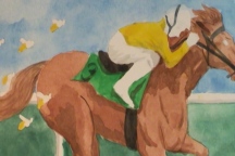
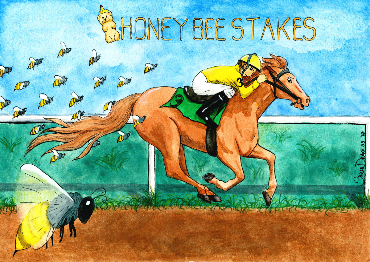
Horseracing is an interesting industry. Without going too much into that specifically, I can say that some of the horses have very interesting names. Some of them I am convinces are a joke against the race callers. “Arrrrrrrrgh” is a horses name. Often a horse is remembered by having a race named after them. I’ve gathered a number of these races – one for each month – and I am going to do an illustration for them. This is my illustration for the Honeybee Stakes. I’m going to walk through the process, and there’s also a speedpaint video as well.
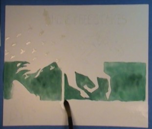
Once I had my rough draft done, I traced the sketch onto better paper using my light box. After that, I used masking fluid to cover up the little bees and the letters. Then onto a water wash for what will be the grassy area. I get a much smoother wash when I use wet on wet.
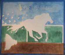
A little dry time, and then I do the water wash for the track area. I enjoy the way you can just build on top of water color to make the painting as rich as you want. I did a few layers of darkening the brown of the track before moving onto the sky. Having the bees and the letters masked made it quite easy to do a nice sky wash.
Dabbing at the wet blue paint with a paper towel makes for nice little impressions of clouds.
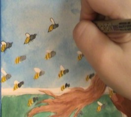
I didn’t mask the big bee, so I was careful around him, as well as my runner and the rail. Once the blue and green were dry I rubbed the masking fluid off of there.
Next onto the horse, and starting on the jockey and the bees. I used a photo reference of the horse to make sure the shadows were in the right places.
Lots of Tiny bees. No wonder the horse looks worried.
I finished the details at the end with colored pencils and a white gel pen.
The original lapsed time for the video after chopping out all of the pauses was 4 hours and 11 minutes. I also chopped out the time to mask the bees and letters.
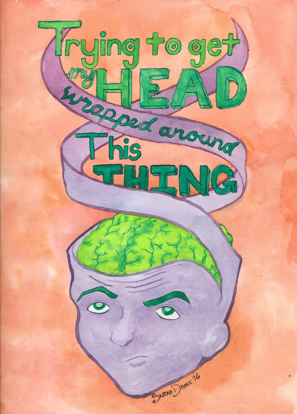
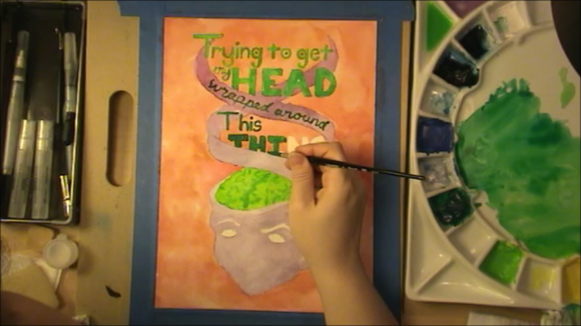
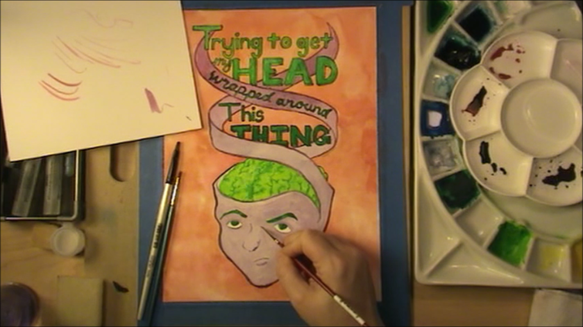
I’ve heard the phrase “trying to get my head wrapped around this thing” a million times, said in a handful of ways. For some reason in a meeting one day the way someone said this, and the way his hands moved when he said he got me going down the path of this illustration. To be honest I’m not sure about the colors, but I didn’t have a better idea when the Husband said the brain should be lime green, so there you go.
The Process
It used to be I’d just work on something until it was done. Usually the paper was fried by the time I was done because of all of the erasing, but I never started on a new paper. I always felt like when I did try to start clean on the same picture, there was some piece of it that was lost from the original each time. I only mention that in hopes that someone will relate, and hear me say that it gets better :).
As I said, I was in a meeting, so I just did a quick doodle of the idea in my notes margin so that I wouldn’t forget it. On the airplane ride home from that trip I worked on a rough draft in my Moleskin sketchbook. It was the last page, and I promptly forgot about this for a bit when I shelved my full sketchbook.
water wash on the background
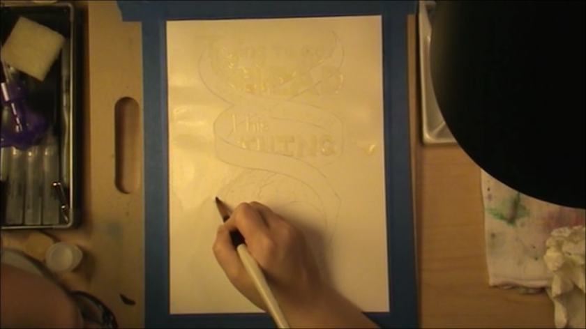
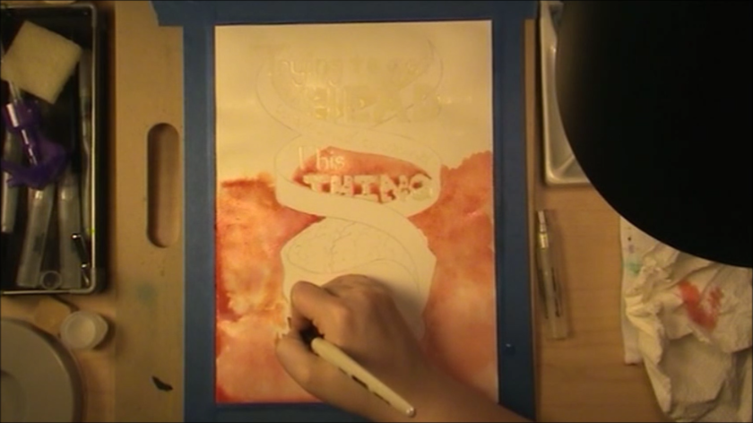
Once recovered, I decided I was going to do a process video. Video editing is quite a bit harder than I gave it credit for, so the video will be a follow up, hopefully later this week. ^_^; (Update: This is now available!) First step was to redraw the head to larger paper. I hadn’t done anything on the lettering, so the first copy I did was where I got the letter forms the way I wanted them. I then traced the whole thing to a new paper. Note to self: trace the drawing before you paint the rough draft next time. Tracing will be easier. *ahem* Once everything was traced and the video camera was set up, I used liquid mask on the letters so that I could do the background without worrying. I then did a water wash on the background area.
I started dropping my background color onto the wet paper. I love the way wet on wet watercolor spreads and you get kind of a cloudy effect, if you want it. Once this step was complete and dry, I moved onto the head area. I similarly started wetting the spiral parts at the top and then dropping in some purples I’d mixed with the goal of a nice gradient.
I love liquid mask. Need practice, but love it!
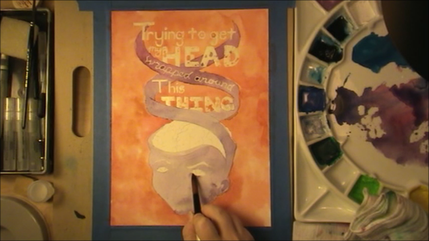
I did a few layers of purple on the face playing with the idea of more realistic shadows, but I ended up washing all that out in the end. I then started on the base color for the brain, and then got to pulling of the masking fluid from the letters. Note to self: don’t get sick and leave the masking fluid on for an extra day. It will ruin the paper underneath it.
gah!
Yup, the middle of the A ripped right on out when I pulled the mask off, in addition to a bunch of other little rips. I decided not to let it get to me and just carefully moved on. It makes me feel like this is more of a Final Rough Draft that I will definitely revisit later.
Another gradient for the text, and a bit of detailing added to the brain. After this I used my nip pen to do the outlining for the letters. It wasn’t my original idea but the paper fried from the mask, it seemed the best way to be as precise as possible. I was still using water color here. It’s a bit tedious, since you have to load the nib with the paintbrush (unless you mix enough paint for dipping).
I did the outlines for the head portion with a med/small brush, since I hadn’t masked that part off. This when MUCH more quickly than the letters. Having the details on the face filled in a bit sure made it pop more! I rather like how a piece comes together during the outlining stage at the end when you’ve done it this way. You can watch a number of mistakes not matter as those crisp lines start to go down. Especially working with watercolor, which gets more beautiful the more you give up control.
I love how the brain turned out. Another example of crisp lines making a difference.
And there he is. I hope you enjoyed learning a bit about my process. It changes over time as I fall in love with a new way to do things and meld it in. In the future I certainly intend to do more of these posts, as well as posts that talk about the supplies I like to use, etc.
Follow the @teamdrakeprod twitter for more of my artwork that is posted between our weekly blog posts!
 Dabbing at the wet blue paint with a paper towel makes for nice little impressions of clouds.